

Industry: B2C | Ed-Tech | Mobile App Concept
My Role: Solo Product Designer | Visual Design | UX Research

Figma | Pen & Paper
TL;DR
This was a 5-day end-to-end design sprint challenge where I created Artefacts, a mobile app concept that lets users scan artwork for quick and curated insights and offer to save favorites to revisit later.
As a lover of art history and frequent art museum goer, I chose this challenge prompt and used provided UX research and background to address a clear problem: museum visitors want more context, but don’t want to dig through overwhelming search results mid-visit.


2024
The challenge
Artwork with too much or too little context.
Many gallery visitors are left wanting more interesting facts than what the small plaque provides. Googling the artwork at hand often forces users to sift through long, overwhelming pages that pull them out of the moment.
Gallery viewers are either flooded with too much info, or are left wanting more; especially those who prefer exploring on their own without a tour guide.
The solution
Offer digestible facts on the go.
I designed Artefacts to be a pocket sized mobile art historian that delivers fast and accessible facts through scanning famous artworks so users can elevate gallery visits without interruption.
“Sometimes I’ll do a quick Google search... but I usually just find long articles that are super overwhelming and take me out of the moment.”
– Nick, museum visitor

Sprint day 1

Reviewing research and boiling down key insights.
I reviewed the challenge brief, desk research, and user interview transcripts, and distilled it down into a single major insight: gallery goers are looking for quick and interesting facts that have just enough context to enirch their visit without pulling them out of the moment.
Checking out the competition.
I kicked things off with a review of similar apps to understand how they approached this problem and get a better sense on what users were finding useful.
Translating research into a simple flow.
I designed the main user flow to mimic the same simple experience as viewing viewing art in a real gallery.


Sprint day 2

Building early concepts from research insights.
Using my research insights, I brainstormed and explored some core ideas around quick scanning, layouts for artwork details, browsing artist bios, and saving favorite works.

Rebranding to Artefacts.
Originally titled ‘GalleryPal’ in the challenge brief, I felt this name was way too casual and playful for an app that focused on serious, educational content.
The rebrand to Artefacts better emphasized the app’s scholarly and refined tone.
Sprint day 3

Building wireframes in preparation for first round of user testing.
Rendering my concept sketches into high fidelity wireframes helped create a solid foundation for the final design by refining the layout to test Artefact’s overall functionality. Navigation, button placement, and user flow were all adjusted.
Round 1 testing results: no problems in the flow.

I ran my first round of user testing with five in-person participants to confirm that completing the core flows of scanning artwork and saving favorites were easily achievable.
At the conclusion of testing, I was thrilled that no usability issues came up (which was a first!)
Sprint day 4

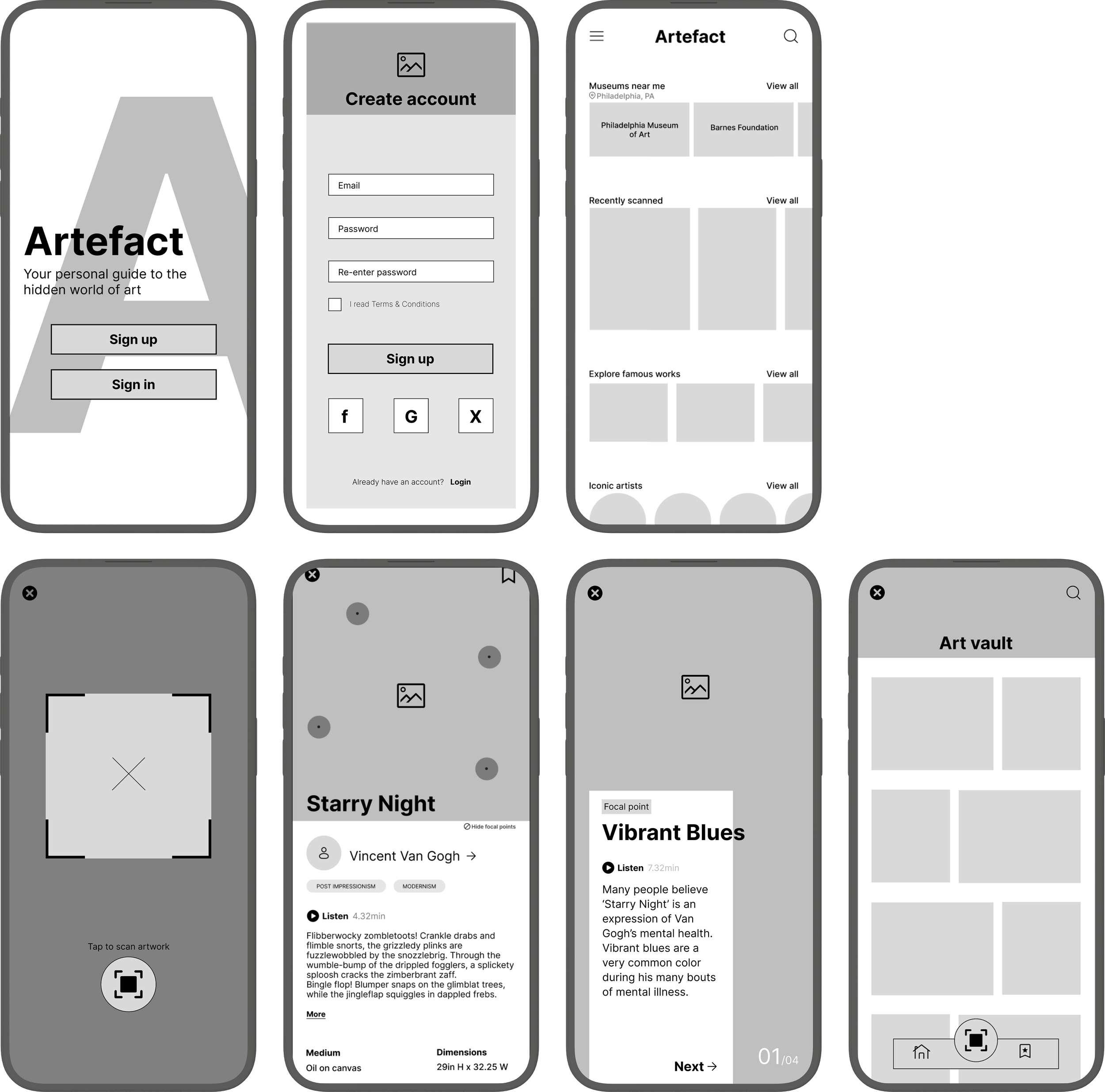
High-fidelity prototyping & aesthetic choices
I translated my tested wireframes into a high-fidelity prototype in preparation for the second round of user testing.

I chose a dark, muted palette of ultra-dark cyan to echo the quiet, introspective feel of museums.
Antique yellow highlights interactive elements.
I designed the scan feature to be central on the navigation bar to naturally guide users toward the app’s main purpose.
Tapping on an artwork’s interest points grants access to quick facts about the piece.
Explore recently scanned works, locate museums and galleries, and browse all things art.
Favoriting lets users revisit and explore artworks later without re-scanning.
Scan function
Brand & color scheme
Visual points of interest
Home
Saving art to the Vault
Design sprint: day 5

Final prototype testing & refinements.
I conducted a second round of testing to gather usability feedback. Overall, users found the app intuitive and liked the dark theme with yellow accents, but also brought to attention several areas for improvement.
Issues and implemented solutions
I added clarification to the scan button, making it consistent with other icons and more easily identifiable.


Improve legibility
I implemented an option to toggle POI’s on and off so users have more control over their experience

Separating artists from artworks
I increased text contrast and chose darker, less busy imageryfor proper accessibility.
Missing scan label


Hide points of interest
I split the Art Vault into separate screens for artists and artworks to help users find their saved favorites more easily.


Project learnings
Studying art history for years in college played a huge role in how naturally Artefacts came together. I’ve experienced firsthand the issue of wanting more info on a piece, and having to step aside and Google and sift through dense Wiki pages. It was a testament to how your past, no matter how unrelated it may seem, has the power deepen your design work.
Start with function, then finesse.
Due to the significant time constraint, I had to make the core flows my absolute priority over aesthetics. Testing early helped me spot any potential friction points before I spent time on color, type, or microinteractions. Getting the basics locked down first carved out just enough time to decide on visual polish.
Thank you!
My background was a huge design strength.

Connect with me
Work with me
Availability
Open to freelance and full time UX work.
Let’s collaborate on your next product or problem.
Contact
West Chester, PA
Marinaceto.design@gmail