

Industry: B2B, SaaS | Governance & Compliance
My Role: Lead Product Designer | Project Management | Client Lead
Figma | Miro | Riipen | Jitter

TL;DR
I led a design team to redesign BoardSpace’s core features and tools: the agenda builder, ‘Meetings’ landing page, and minute recording process.
My team delivered a successful prototype currently in production that reduced task complexity and fully complied with the company’s refreshed UI design system.
The challenge
BoardSpace: rich in features, overwhelming to users.
The web platform supported all essential governance board meeting functions, but many features were built solely from a single developer’s perspective.
Users consistently struggled with cluttered layouts, confusing meeting-minute recording process, and a document builder tool that did not match common design conventions.
Research & insights
Since BoardSpace had a large archive of past user research, we dug in and started to synthesize user data.
We reviewed user testing videos, transcripts, site architecture, and performance data to map out task friction, pains, and emotional trends to spot where users were getting stuck and why it mattered.
Major findings


2025
We utilized previous research data and made it actionable.
Overwhelming number of screens and clicks to complete tasks.
Unintuitive and rigid agenda builder.
Hard to locate and time consuming meeting minutes recording feature.
Confusion about meeting statuses, document attachments, and roles.

were just some of the techniques we used to really
understand frustrations and opportunities.
Want a more in-depth look at our research, insights, and process?

Client collaboration
We regularly met with BoardSpace’s CEO and internal team. Their feedback was crucial in helping us understand the product, its users, and what was technically feasible within our project roadmap.


Weekly meetings and touch points helped keep us in sync.
Sitewide hueristic audit
We took a really close inspection of BoardSpace’s existing experiences and identified any usability violations based on Nielsen Norman’s hueristic principles.
Violation: aesthetic and minimalist design
Multiple colors, columns, and buttons created big visual hierarchy issues and confusion as to which elements were most important.

Before redesigning anything, we diagnosed the system.
Legacy agenda document builder

Legacy ‘Meetings’ landing page
Violation: match between system and real world
The structure of this tool broke almost every expectation users had for a document builder, confusing users so consistently that it became the top source of IT support tickets and help requests.

Legacy minute-recording
Violation: user control and freedom
The minute-taking tool forced users to exit the flow to make basic changes like editing a presenter or an item’s duration, creating major workflow disruption.
Competitive audit
Learning how other leading governance platforms handle things like structure, compliance, built-in tools, and role-based workflows was essential to accurately redesignign our flows.

We then benchmarked BoardSpace against 3 leading competitors.
The redesign
Pulling inspiration from competitor platforms, business feedback, and research insights helped to shape the redesign the whole way through.
To make sure our system actually worked, we built a fake nonprofit board with everything from roles, documents, and agendas to test how the pieces actually fit together with clear context.
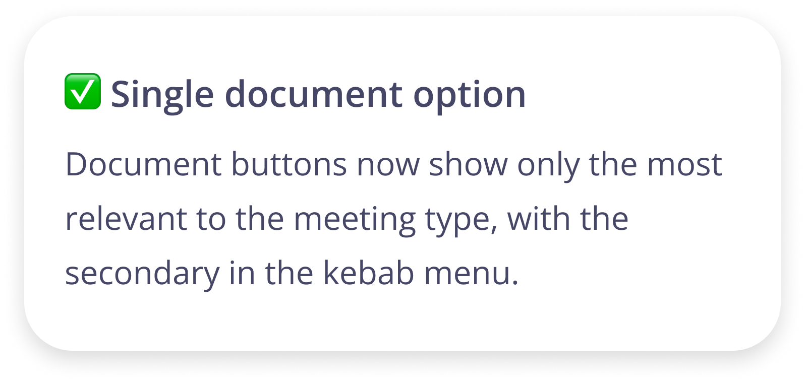
Simplifying creating agendas, sorting meetings, and taking minutes
Modern agenda document builder
We brought a simplified structure with clearer CTAs, status indicators, and templates.


Modern agenda builder
Focused on restructuring the design to resemble more familiar document builder models (think Microsoft Word template picker).


Modern minute-recording
Redesigned as a single, scrollable view containing all parts of the agenda eliminating the need to jump between flows.


See the awesomeness for yourself and interact with our prototype!


Project learnings
Leading this project was a wild ride, full of plenty of pushback from my own team and even the business side of things. Juggling conflicting opinions meant keeping everyone on the same page and working toward the same goals. Delegating based on team strengths was crucial to maintaining momentum, especially when personal roadblocks came up. Watching the team rise above those challenges and deliver what had eluded three previous teams was an incredible feeling.
Becoming part design lead, part cheerleader

Collaborating with Pat, BoardSpace’s CEO, and Jeff, the sole developer, was a big highlight of the project. Our weekly meetings were absolutely invaluable, and hearing their feedback and iterating more than three times over truly shaped the end result of this redesign. But I’ll be the first to admit- our design wasn’t perfect. Since my team only tackled only part of BoardSpace’s feature list and didn’t personally conduct user interviews, there are definitely some areas of imperfect UX. But in the end, we created a solution that worked and helped set the stage for future improvements, and I’m insanely proud of my team for getting it over the finish line.

Dealing with imperfect UX & business collab
Thanks for reading!


Connect with me
Work with me
Availability
Open to freelance and full time UX work.
Let’s collaborate on your next product or problem.
Contact
West Chester, PA
Marinaceto.design@gmail