

Industry: B2C | Food Tech | Mobile App
My Role: Solo Product Designer | Visual Design | UX Research
Figma | Pen & Paper | ChatGPT | Jitter
TL;DR
This was a solo mobile app project I designed to solve a problem that I, and pretty much everyone I know, kept running into: there’s no easy way to save, organize, and share recipes from all over the internet.
RecipEasy lets users import recipes (without clutter), sort them into custom collections, and share with friends and family. It’s a clean, flexible solution for modern home cooks who are tired of sorting through screenshots, unclear links, and scribbled notes.
The problem
Few online recipe keeping platforms exist.
For home cooks, online recipe discovery often means wading through a sea of ads, OP’s long personal stories, and poor organizational tools.
Existing platforms fall short; either cluttered with irrelevant content or lacking a centralized place to save, organize, and share recipes. Users often resort to screenshots, messy bookmark folders, or texting links to themselves.


2024
RecipEasy’s objective
I started research originally with the goal to solve a common frustration: reduce the clutter and unimportant information on recipe websites & blogs.
But through research, I uncovered a larger opportunity I hadn’t planned for.
Users didn’t just want cleaner recipe formats, they really needed a better system to manage, access, and share recipes altogether. Sites like TikTok and Pinterest let users bookmark recipes, but didn’t do anything to make the pages quicker or easier to use.
RecipEasy had to become more than a decluttering tool.
It needed to become a central hub where users could save recipes from anywhere online, share them effortlessly, and stay connected with fellow home cooks.
Research methods
Key insights


Current methods of sharing recipes are clunky and fragmented.
Users want clarity and simplicity when viewing recipe content.
Trust, as in recipe ratings and community reviews, is crucial.
Simple and fast organization is hugely important.

I started my journey with desk research, then followed up with screener surveys and finally five in-person, moderated user interviews to uncover how home cooks find, save, organize their recipes- and most importantly; why current tools weren’t working.

Want a more in-depth look at my research, insights, and process?


Synthesizing insights

To make sense of all my research data, I used affinity mapping to group action and thought patterns from interviews, then created two empathy maps to capture the two distinct generational differences I found in user needs and behavior.
This led to two key personas, Katie (29y) and Anne (61y), who helped me prioritize features like clean recipe views, credibility markers, and flexible saving options for both online and personal recipes.
Want a more in-depth look at my data synthesis process?
Insights into action
I translated my insights into four focused features.

Direct recipe access: AI scans and strips away recipe website clutter to surface only the essential info.
Effective organization: users can store recipes, both personal and online, in one place.
The onboarding flow lets users personalize RecipEasy from the start by selecting dietary needs, allergies, and creators they want to follow.
Want to see more of my user flows?
Built-in trust: clear recipe sources and aggregated user ratings boost recipe credibility.
Simple sharing: in-app messaging makes sharing recipes familiar.
To support these features, I mapped several user flows for critical tasks like onboarding, importing, saving, and sharing.
Creating red routes


Visuals
Bringing features to life with wireframes.
I built the first iteration or wireframes with these flows in mind, prioritizing clean content, navigation, and familiar design patterns to reduce cognitive load.
First round of iteration.
Early user testing revealed a disconnect between browsing and searching, so I merged the home and discovery screens to streamline recipe exploration.
Design system
Light, minimal interface with calming blue-purple accents to keep things friendly.
Black accents highlight key actions for accessibility.
Rounded corners and spacious layout add a modern, clean feel.
Want a more in-depth look at my design system?
High-fidelity prototype

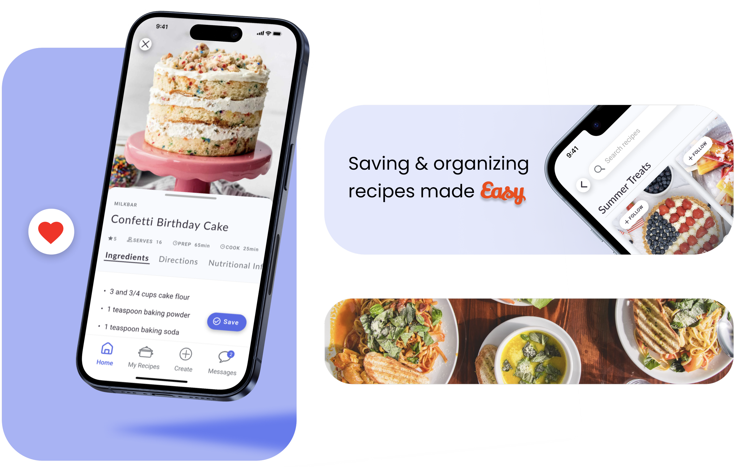
Simple organization
Modified one-tap heart button to save recipes to a customizable collection.
Outcomes of my second round of user testing led to key usability tweaks that greatly increased flow and overall usability.

Clearer buttons
Increased contrast & visibility of the "Save" button.
Onboarding
After creating an account, users can select preferences like dietary restrictions, cuisines, or favorite chefs to immediately personalize their home feed.

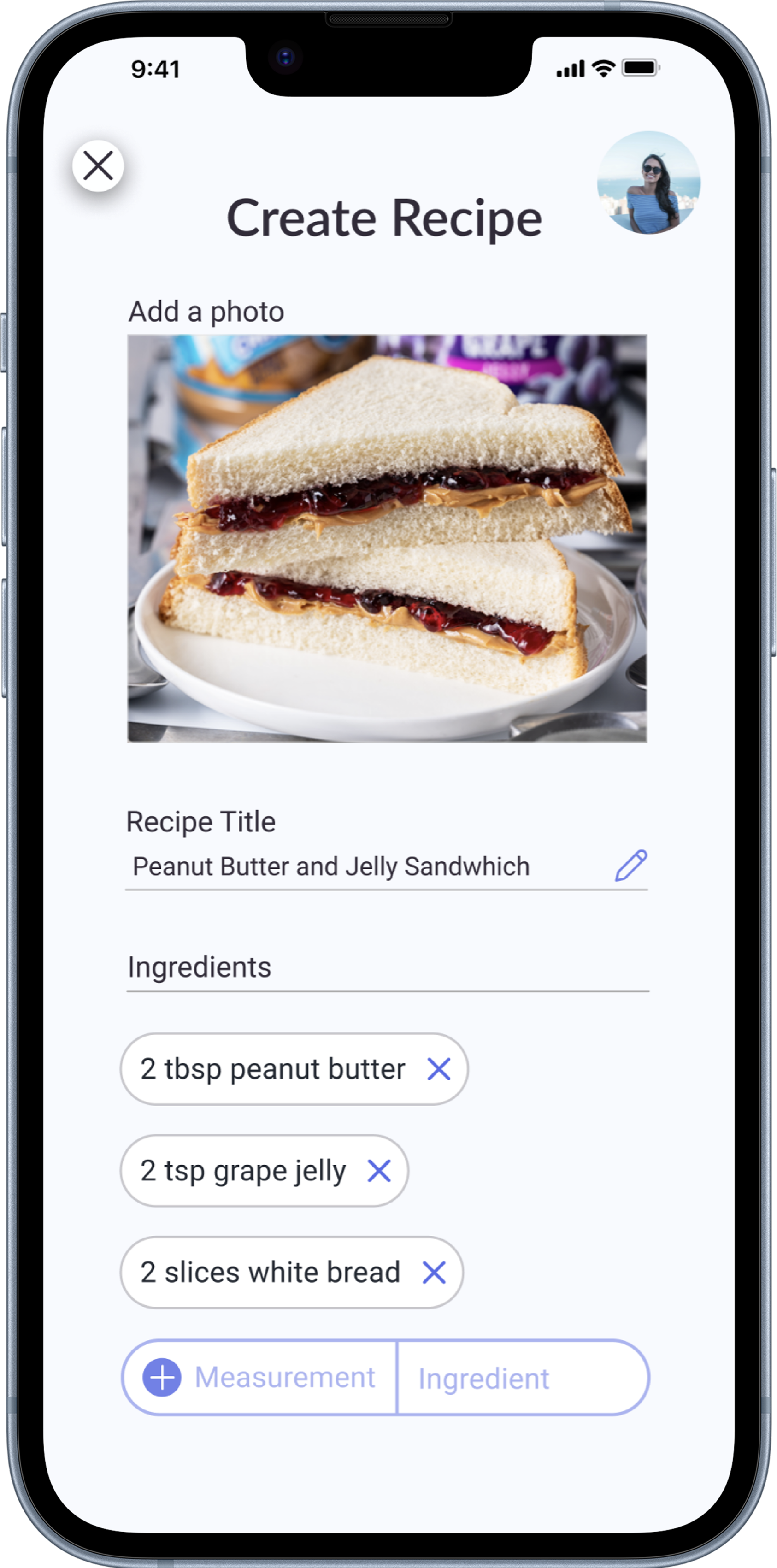
Easier editing
Reworked adding & editing ingredients and measurements in personal recipes.

Sharing recipes with friends
An integrated chat feature lets users send and receive recipes directly, no more juggling screenshots or emails.
A social feature connects friends and family to browse each other’s recipe collections, similar to Pinterest.

Home feed
Curated home feeds feature trending, seasonal, and personalized recipe suggestions along with the latest recipes saved by followed users.
Combines discovery and saved recipes into one dynamic, social feed.


See the awesomeness for yourself and interact with RecipEasy’s prototype!

Recipe import & organization
Users can create and save their own recipes from home, keeping everything organized in one place.
Or import from any site, stripping away ads and long-winded stories to extract only relevant recipe information.


Project learnings
I realized through my research and interviews that the real pain wasn’t the extra noise in recipe blogs/websites, but that people truly had nowhere to save and organize all the recipes they found online.
I totally shifted this projects’ focus to built a flexible, modern recipe keeping platform that actually solves this problem by helping home cooks keep everything in one place- no printing, handwriting, or screenshot chaos required!g.
The enormous value of research forward design.

I realized through numerous rounds of testing that even the most useful features can feel overwhelming if they’re not clear or intuitive. It really drove home the idea that good design isn’t just about looking nice, but making people feel confident and in total control of the product.

Walking the line between simplicity and functionality.

Thank you for checking out RecipEasy!
Currently, I’m collaborating with developers to bring RecipEasy to life, and is now in early development.

Connect with me
Work with me
Availability
Open to freelance and full time UX work.
Let’s collaborate on your next product or problem.
Contact
West Chester, PA
Marinaceto.design@gmail