

Industry: B2C | Health Tech | Mobile App
My Role: Solo Product Designer | Visual Design | UX Research
Sticking to a fitness routine is rarely about access to exercises or proper equipment. It’s really about winning that personal mental game of staying accountable, feeling supported, and keeping your momentum going.
Figma | Pen & Paper | ChatGPT | Jitter
TL;DR
This was a 90-hour UX design challenge to concept, prototype, and test a fitness app that tackled two key business goals: boosting user engagement and increasing long-term retention.
I designed a gamified, socially focused experience that turns workouts into group challenges, complete with progress tracking, badges, and built-in social messaging functionality. Each feature was shaped by user research, testing, and human psychology principles to keep users motivated and coming back.
The problem
Staying motivated with fitness is hard.
Many fitness apps do a great job of tracking workouts or syncing up with a smart watch, but they often miss the biggest hurdle of all: feeling motivated enough to stay consistent.


2024
FitCircle’s objective
As an avid exerciser, I know how hard it is to stay consistent.
I started the basis of FitCircle’s research thinking I’d just improve on the footprints of already existing fitness apps. But the entire scope and objective of FitCircle shifted once I dug into why people actually stay motivated.
Powered by psychology and momentum.
Research methods & outcomes
Key insights


Motivation comes from competition, both internally and externally.
Social support networks help hold accountablility.
Many fitness platforms don’t address the basics of user motivations.
Users look for flexibility and variety with their workouts with quick access to health data and trends.
And as I started desk research, it turned out that scientce backs this up. One study showed competitive environments boost workout frequency by around 90% when compared to solo environments. time.com
Another study found working out even with only a single other person increased gym visits by 35% nypost.com.

When conducting my interviews, I noticed almost all of the athletes, bodybuilders, and casual exercisers felt the most motivated when competition kicked in. That could mean participating in a team sport, placing on a gym leaderboard, or beating a personal record.

Want a more in-depth look at my research process?

Gamifying to solve both motivation & business goals.
I came up with the idea to gamify FitCircle to solve for increasing engagement, retention, and motivation to keep users completing their exercises.
Introducing timed challenges, rewards, and social components like joining a social fitness “Circle” made progress more rewarding and easier to stick to.
Personas helped shape product features.
This led to the development of two personas: Cameron (27F), a marketing manager who thrives on teamwork, and Chris (32M), a creative professional who struggles to stay active after long hours.
Both perspectives helped me prioritize features like visual progress tracking, challenge variety, and social connection.

Synthesizing insights

To make sense of the mountain of data collected from my research, I used affinity mapping to group together the shared actions and thought patterns from my interviews. I then went on to build an empathy map to capture needs, frustrations, and motivators around staying consistent with fitness.
Want a more in-depth look at my data synthesis process?
Insights into action

Research becomes structure.
I pulled together everything I’d gathered so far, from competitive analysises to persona needs & behaviors, to draw from when designing the backbone of FitCircle.

Creating FitCircle’s architecture
I spent a lot of time refining the information architecture to make sure this complex idea felt as simple and intuitive as possible.
Navigation in particular had to encourage exploration and social connection while also including all the features needed to record and track fitness metrics and goals.
Want a more in-depth look at my flows and architecture?
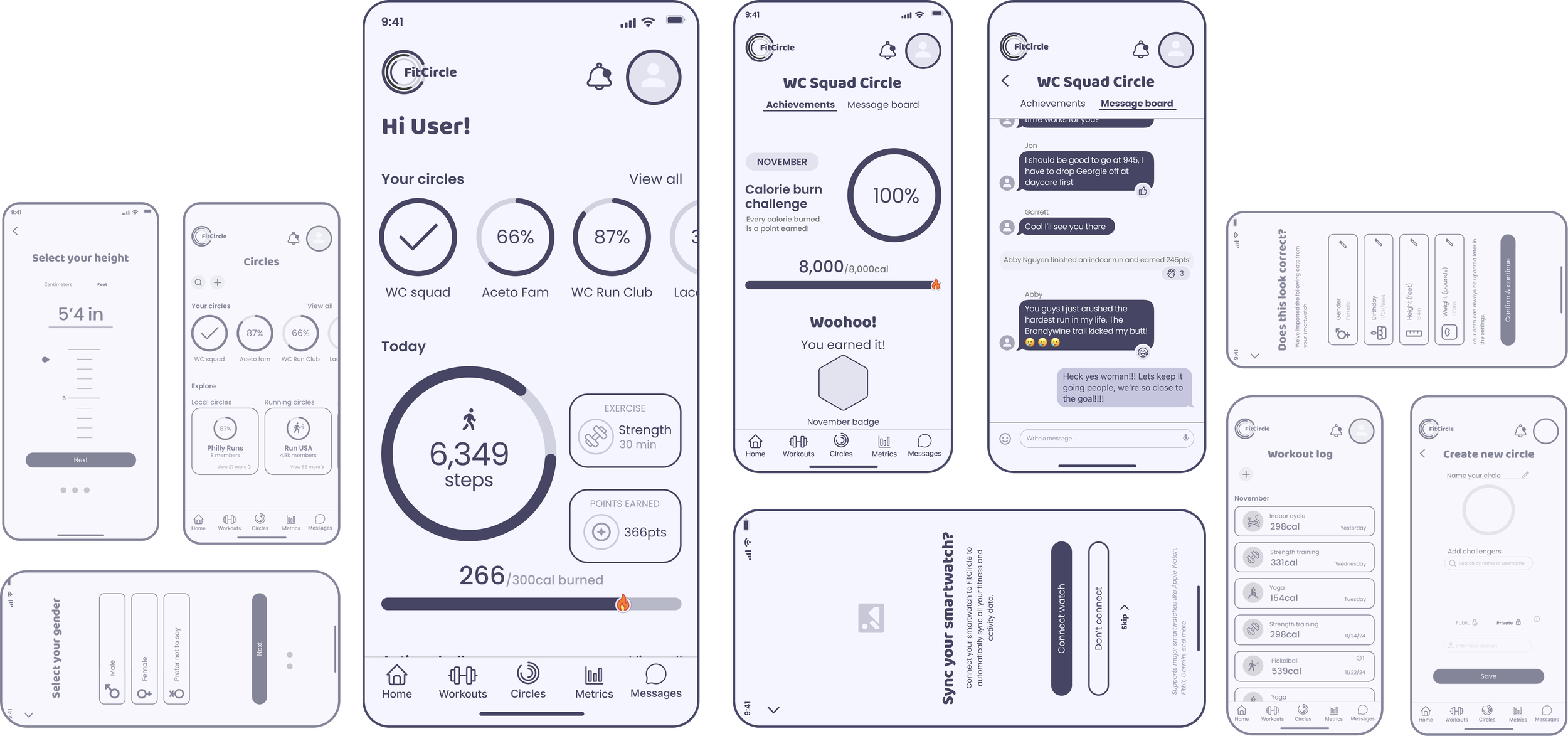
Structure translated into wireframes.
I built wireframes directly from my information architecture, using established design patterns like Apple’s activity rings to keep progress visually familar.
Establishing a visual identity
Design system & brand
I designed FitCircle’s brand name to immediately convey to users that they can join or create a close-knit fitness focused ‘circle’ with anyone.
Inspired by old shool arcades, vibrant accent colors are balanced by a dark backdrop that feels focused yet exciting.
Dynamic visuals like activity rings & progress bars bring energy to keep motivated and active.
Want more on my branding and visual design process?
Iterating on high-fidelity prototypes
Gathering valuable testing feedback.
Two rounds of usability testing and iteration revealed confusion around general navigation, purpose after onboarding, and locating important features like Circles and challenges.
Using that feedback, I created a full tutorial flow during the onboarding process to guide users through important FitCircle features, as well as improved site navigation and clarified some wording.
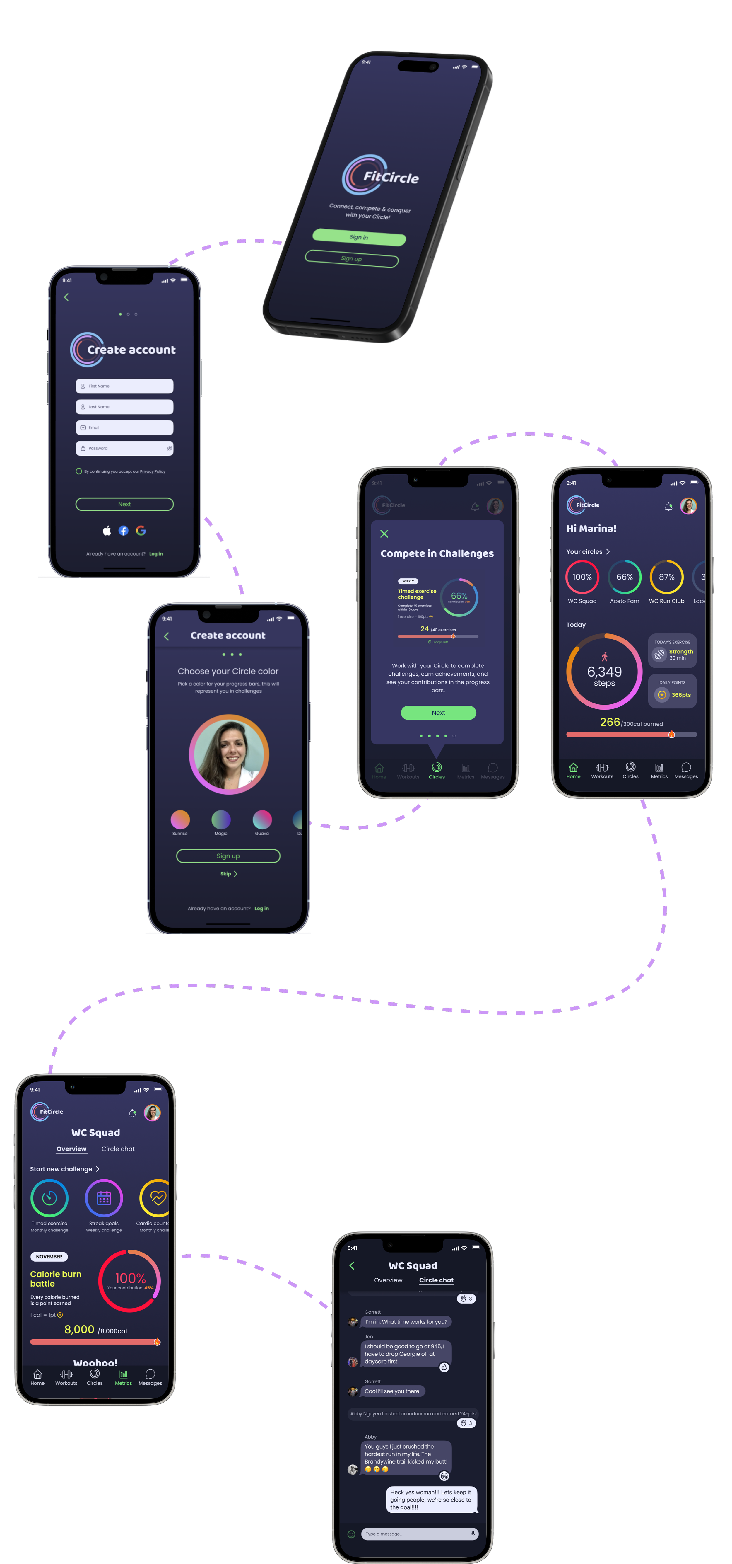
Getting started with FitCircle is familiar and simple.
Onboarding
Choose a ring color, add a profile photo, and sync a smartwatch or enter health data to maximize the fitness experience.
Circles
Join or create a Circle to connect with others to share and compete in fitness goals.
Tutorial
A quick tutorial in FitCircle helps you get oriented with features.
Home
See a dailiy overview of health stats & most recently active Circle.
Messaging
Circle chat keeps users connected with notifications when teammates log workouts or post messages.
See the awesomeness for yourself and interact with FitCircle’s prototype!


Project learnings
Since I was time-boxed to a 90-hour design challenge, each decision from color palette, layout, to microcopy, had to be made fast and intentional. It was daunting at first, but the pressure of the time crunch actually helped me to make fast iterations and rely more on user testing to sort out major issues.
Designing with speed and intention.

Building a gamified system was totally new to me. Designing points, rewards, and progress mechanics was honestly one of the hardest parts of this challenge. With so many moving pieces, I had to balance solving the sprint challenge with fresh and exciting ideas. Each round of testing feedback helped me simplify and make sure FitCircle still felt motivating and accessible for all kinds of users.

How much value truly lives in usability testing.

Connect with me
Work with me
Availability
Open to freelance and full time UX work.
Let’s collaborate on your next product or problem.
Contact
West Chester, PA
Marinaceto.design@gmail